
Mistakes, performance and terrain
The sheet under the map: the mistakes Analyse detects, pace, heart rate and elevation along the race, and the ground you ran on.
Pull up the arrow at the bottom of the map (Show analysis charts) and the sheet shows three sections, one at a time: Detected mistakes, Performance and Terrain breakdown. On a computer they are pages of Analysis data. Tapping a chart point or a mistake in the sheet takes the map to that place.
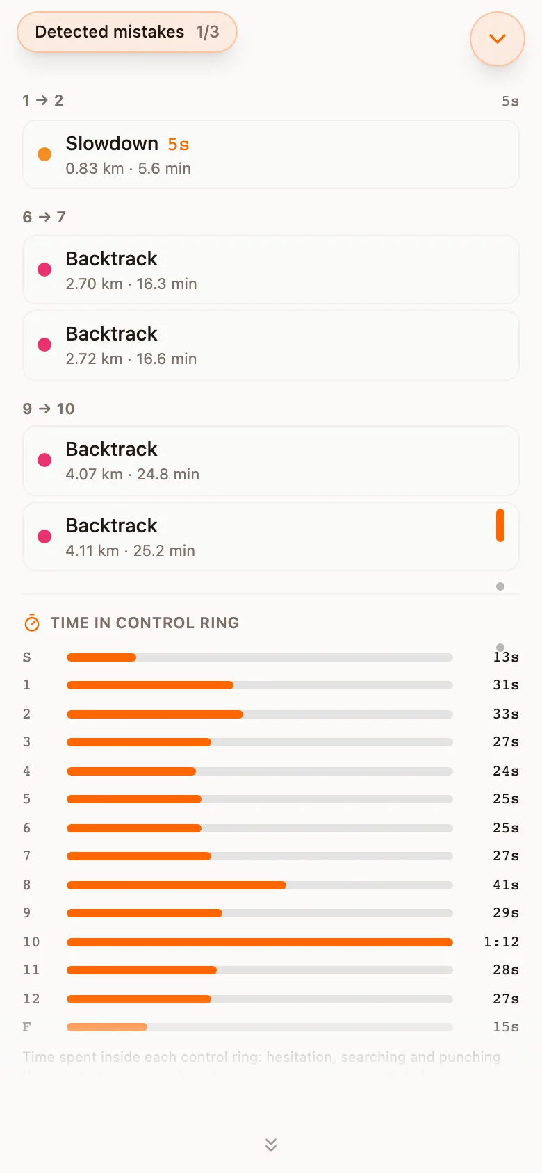
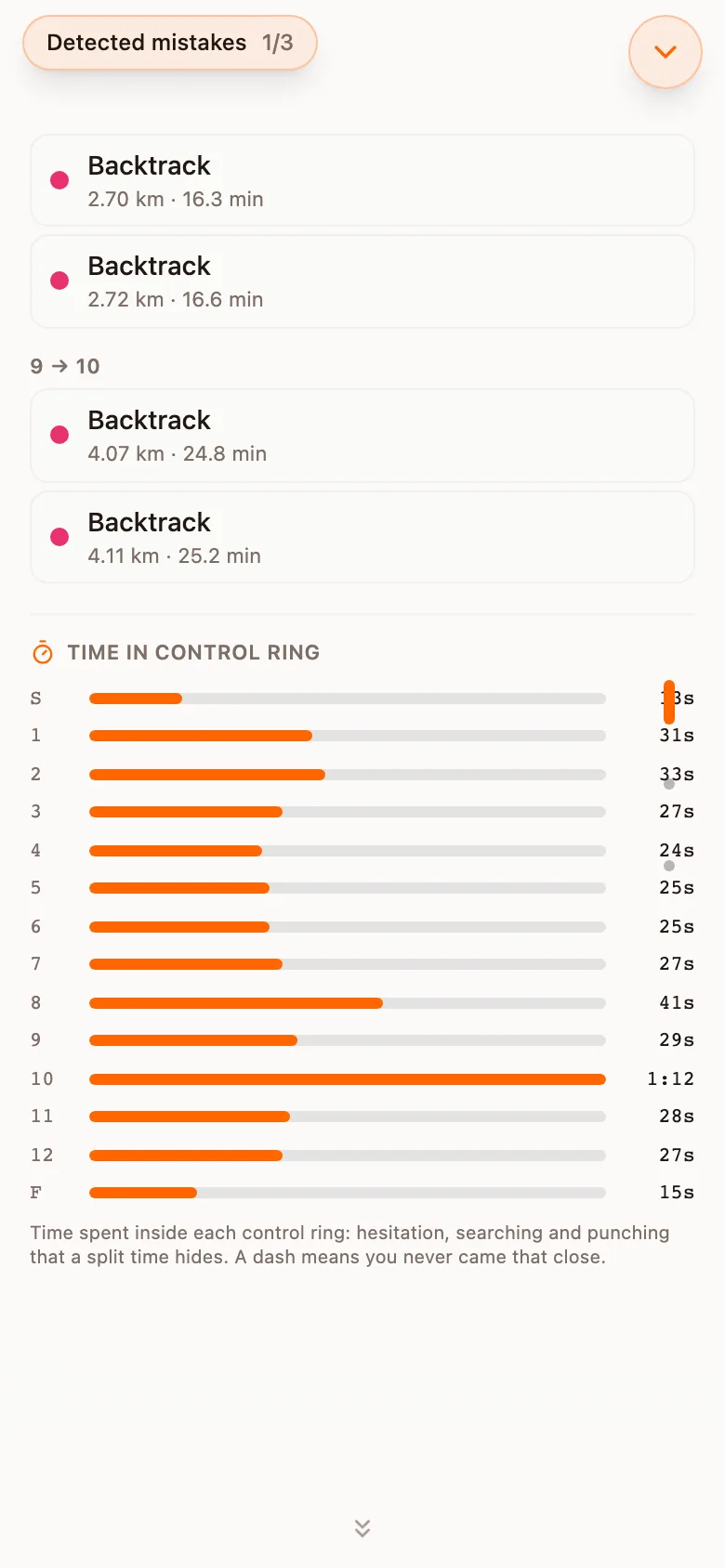
Detected mistakes
Analyse looks for four kinds of event in the track itself, with or without split times. The limits are relative to your own pace where it matters, so a slower runner is not flagged for being slow.
| Event | What it is | Starts counting at |
|---|---|---|
| Stop | You stood still. Shown in red. | Pace slower than 12 min/km for at least 5 seconds, moving no more than 5 m. |
| Slowdown | You slowed well below your own pace. Shown in orange, with the seconds it cost. | Local pace 1.5 times your rolling median pace. |
| Backtrack | You turned and went back. Shown in pink, with the angle. | A reversal of 120 degrees or more within 10 seconds. |
| Off-route | You strayed from the line you drew. Only after you have sketched your route. | More than 30 m from the line for at least 3 seconds. |
Three situations produce a candidate that is not a mistake, and each is filtered out:
- Path following. A slowdown on a path is usually the path bending, not hesitation.
- Contour dodging. A route that traverses rather than climbing straight reads as a deviation but is a route choice.
- Punch and turn. A sharp reversal close to a control is you leaving towards the next one, not a backtrack.
Sprint events allow tighter corners than forest ones: a 120 degree turn round a building is a street corner, not a navigation error. Off-route spans are reported next to the deviation chart and are not counted as mistakes; see Route guess.
Where the headline number comes from
Time in control ring
Below the mistakes, one bar per control shows the time you spent inside its ring: hesitation, searching and punching that a split time hides. A dash means you never came that close.
Performance
Pace, heart rate and elevation along the race on one chart, with elevation filled as a profile and the detected mistakes marked as dots. Time and Distance choose the horizontal axis, Race only cuts the warm-up and cool-down away, and the buttons under the chart switch Pace, Heart rate and Elevation on and off. The round arrow resets the zoom. Heart rate appears where the file carries it. Every chart is drawn on white in light and dark mode alike, with fixed colours, so pace and heart rate mean the same thing in both.
Terrain breakdown
Analyse reads the colour of the map under every point of your track and sorts the ground into classes: Path, Open grass, Open forest, Green, Dark green, Marsh / water, Paved and Outside map. The names are shown in English in every language. For each class the table gives how far you ran on it, how long it took, your average pace (Avg pace) and your Adj. pace.
What adjusted pace adjusts for
Exclude stationary leaves standing still out of the pace figures. The warm-up and cool-down have a folded card of their own, Warmup / Cooldown, so the race figures leave out the jog to the start.
The deviation chart
After you have sketched a route, an extra section, Deviation from guess, plots the distance between your GPS position and the line you drew, with a reference at 30 metres. Every span above it is listed with a button that takes the map to it.
Order and visibility of the sections
Mistakes, legs, terrain, charts and deviation can be reordered, hidden, or set to start folded, under Settings. A hidden section is not drawn and not calculated.